Designing for Screen Printing
Designing for Screen Printing
With screen printing, how good your prints turn out will be determined by how good your artwork is in combination with the knowledge and skill of the artwork separator but also the methods and equipment used by the print studio. Your prints can be affected in so many ways, what inks are used, how taught the screens are, the mesh count of the screens, whether the screens were exposed using film or a CTS, how sharp the squeegees are, whether they are hand printed or semi auto printed, the offset used, the choice and accuracy of colours mixed.
What is most in your control is the artwork you supply and how well you communicate your ideas and expectations. Don’t assume a printer will know your preferences and opinions of what is a nice print, leaving it up to the printer and saying ‘you're the expert, I trust your judgment’ may sound like you are being an easy going customer but actually, what we as printers would like is specifics. Send a spec but be realistic. Exact positioning can be great but remember, what looks the right position and size on a medium tee may not look right on a 3XL or XXS.
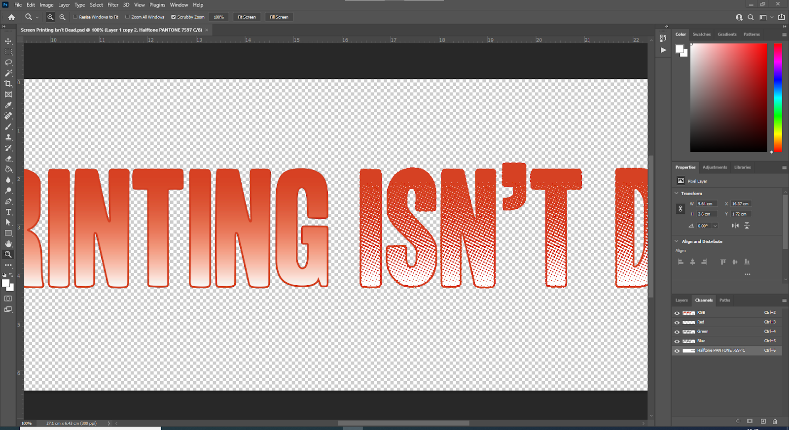
Communication aside, let's talk about artwork. Screen Printing artwork falls mainly into 2 categories, with gradients and without gradients. To achieve blends of colours, photographic elements or fades to the t-shirt colour, the artwork will need to be converted into halftones for areas with gradients. Halftones can be various shapes, angles and resolutions. This is very much a print studio specific set of settings and is down to very acute aspects, even as detailed as how thick the emulsion is on their screens. Assuming you can separate and create halftones for a studio is risky, in our experience we have had one designer in that prepared halftones that suited our process, but even that was complicated getting the files they supplied to work with our artwork workflow. There is nothing worse than trying to halftone halftones. Be a part of the process but leave the settings and halftone generation to the print studio, if they haven’t worked with halftone before, then find a studio that has.

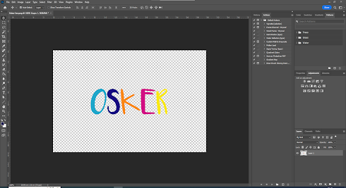
For artwork with solid areas of colour, mainly shapes, fonts and line work, then use vector based graphics.
It can be daunting moving from raster/pixel based images and software programs but it is well worth investing your time and learning how. Without wanting to sound like an old-timer, in my day (pre-YouTube) it was hard graft trying to find out how to do something. The internet is an incredible ever expanding resource for learning things for free. I’m still learning things that save me hours of laborious image processing. When you have vector artwork, you can never really send anything to a printer that isn’t a high enough resolution. From artwork that goes onto a care label, to whole building coverings, vectors are a dream to work with but please follow these rules:
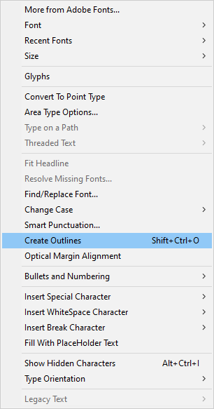
Outline or expand fonts - other people don’t always have the same set of fonts as you and may not have the license to use them. Letters should be objects or paths just like everything else.
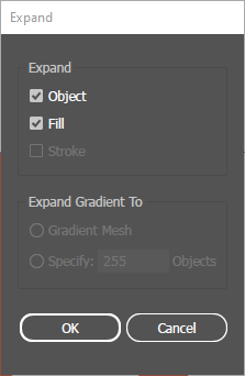
Don’t use masks, what you see on your screen is not as simple as it looks. We receive vector files with so many layers, shapes obscuring others, whole patterns masked. If you have a shape masked or overlaid by another you need to remove the area of all shapes which are unseen, so that the areas of different colours meet at a perfect edge also known as butting.
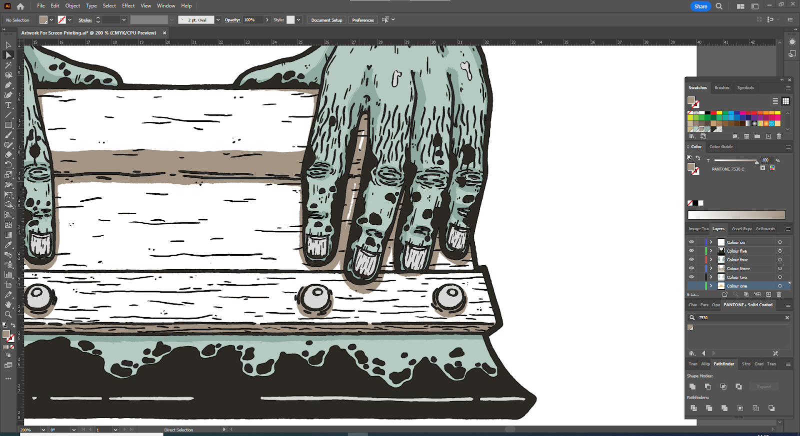
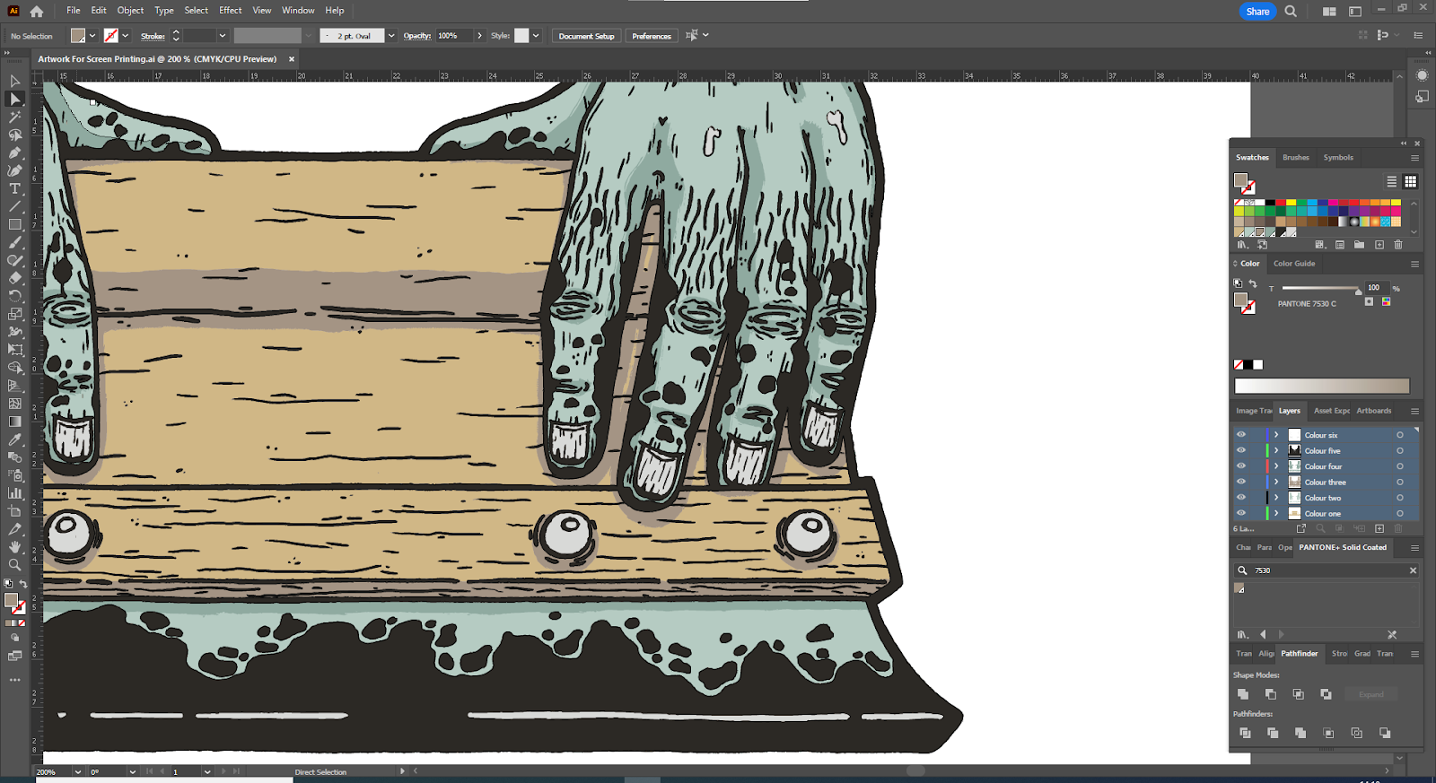
Colour handling - the most common colour format to use for garment printing is Pantone’s Solid Coated book.
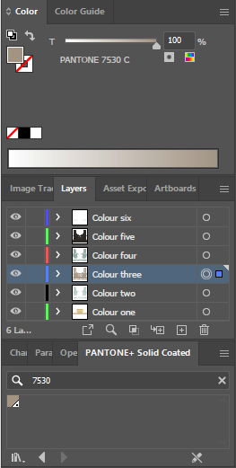
Pantone or other colour standardisation systems allow you, the brand you are working for/with and the printer to be talking about, and most importantly looking at, exactly the same colour. Monitors and colour spaces (eg sRGB, CMYK etc) will display colours in vastly different ways. The angle at which you view you monitor can also create huge variations in the colour you see. Using a colour book creates certainty, but make sure you are using the same colour standardisation system as your printer. You can also employ swatches to your artwork from the available colour books in your graphic software or by creating new spot colour swatches, naming them after the pantone reference (like ‘123 C’) and colouring them to the closest CMYK, RGB or LAB formulas. You can search the web for these or sign up to Pantone’s Connect service.
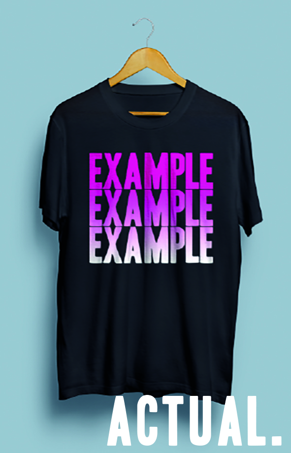
A colour range is not the same thing as a colour. 10% black, 11% black 12% black etc are all different colours so a grayscale image cannot be described as a black and white design. It can however be converted into a ‘1-colour’ halftone image but even so we like to use 2-3 colours within a grayscale image to give the truest representation of the original image and an end result with more depth.
Lastly, don’t save a vector in a raster format (png, jpeg). You’ll have undone all of your hard work. Save your image as a pdf or an eps file and leave the file as editable.
For templates please go to https://www.getagripstudio.com/design-artwork-guide
Comments
Post a Comment